Color is probably the most crucial part when it comes to design. Now, this applies to if you’re working on any social media design, a website design or even any brand’s colors. Choosing the right color palette is the foundation of any visual aspect. The color palette can be the fundamental principle that decides or influences the final look and feel ANY project. Different color palettes set a unique visual identity and are often the source of evoking different emotions.
Now, when you have a color palette that is balanced, well balanced in fact, then you can have the most visually captivating design output possible, even beyond it. But since we’re talking about color palettes for modern interiors, we’ll just stick to that. And, as a trusted and renowned interior design company Dubai, we know that picking and sticking to a stylish and graceful color palette for your home in Dubai can be an overwhelming task. And that’s precisely why we’re here to help you out and ease that anxiety of yours.
We’re compiled a list of the classiest interior color trends in Dubai and neutral color schemes for your convenience that sit well with a stylish interior.
Understanding Color Palettes for Modern Interiors
It’s crucial that you have an understanding of how color palettes work, so you’re never reliant on anyone else but yourself, if needed in future. So, we’ll be discussing a little bit about the color wheel and color theory.
In simpler terms, color theory explores how our minds respond to any color. Isaac Newton invented the color wheel, a circular diagram that depicts how every color is related to the other and how can they be mixed to create different shades of each other, and even creating new colors. Newton classified colors into three categories – primary, secondary and tertiary.
It’s simple, the red, yellow and blue fall into the primary category. Now, if you mix ANY of the two primary colors, you’ve created a secondary color. The tertiary colors are developed by mixing primary and secondary colors. For example, blue and green, blue and violet, green and yellow.
What Makes for an Elegant Color Palette?
Sophistication and visually aesthetic are two common factors that make for an elegant color palette. Harmony is key as elegant color palettes feature colors that balance each other perfectly, resulting in a fine visual harmony. Then subtlety is also a secret ingredient in any elegant color palette as it has passive pastel or colors that are muted instead of the bold and vibrant ones. These colors convey a relaxing, soothing vibe. Now, simplicity is what makes or breaks any color palette. If you focus on the monochromatic scheme and not use a lot of colors, then the color palette will have a clean and minimalist approach, conveying elegance with simplicity. The secret of elegant color palettes is that they are timeless and stay relevant over decades and even centuries. They have the power to transcend over time. When white and black or gold and navy are combined, they’re always known to have been classy, stylish and timeless.
Color Palettes for Modern Interiors For Modern Interiors
Now that we’ve discussed the relationship of each color with other colors, its shades and what message and emotion each color palette evokes, we’re finally going to discuss the interior color trends for modern homes in Dubai. We’re sure that the following list of elegant color palettes will unlock the creative interior designer in you with a massive range of visually captivating and eye-catching combinations for your accent wall ideas.
Nature
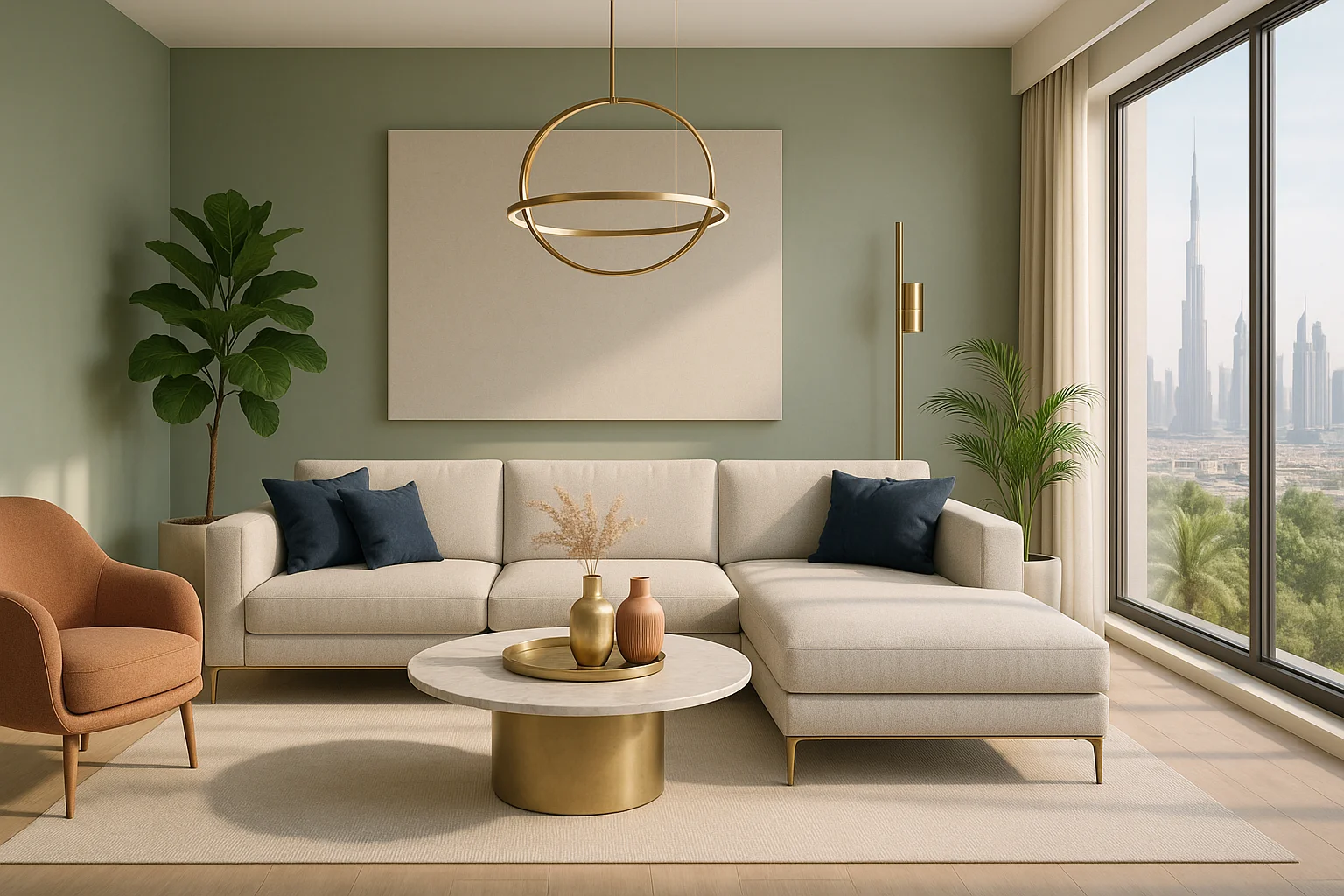
As the name suggests, this color palette is meant to reflect the nature and all that is beautiful in it. The network of colors in this palette are subdued and louder tints of blue, pale gold and grass green. Each shade, each color is evoking a sense of calm, elegance and in harmony with the nature. In a city like Dubai, which is a concrete jungle, home of the skyscrapers and sky rises, this palette lets you forget what’s on the outside and lets you be in harmony with the nature. This is an ideal choice for interiors which are seeking closeness with nature.
Sage & Ivory
This color palette blends contrasting and subdued natural shades, evoking a sense of style and combining it with the right kind of balance. The sage and ivory palette evokes a sense of peace, quiet and a feather-like lightness with elegance.
Tranquil Seashore
As the name suggests, it’s no secret the color palette is a serene combination of dark teal and sky blue with mint green. It’s meant to reflect the calmness a pristine coastline brings to sore eyes. Add a light gray in this palette for a neutral effect and this is a soothing palette for a modern home in Dubai. This sounds great of you have any accent wall ideas popping up in your mind.
The Serene Sunset
Who doesn’t love and appreciate the nature at golden hour? This palette adds a touch of vibrant and visually eye-catching interior for nay modern home. The pale and bright orange colors offer warmth and calm that one experiences at the golden hour. Throw in a mix of a subdued peach and pink shades and you’ve got yourself an energetic feel to the interior.
A Blues’ Monochrome
This color palette features varying shades of the same one color, blue. This monochromatic blue color palette exhibits flexibility in the different shades of blue as dark blue is a firm foundation whereas medium blue shade displays a bit of brightness. The pale and light blue shades provide a sense of comfort, tranquility best suited for straight-lined and minimalist interiors.
Enchanting Forest
This is an enchanting color palette which takes you into the heart of a serene forest. The forest offers a lush green shade and if combined by the lime and bright green shades, this color palette gives you a fresh, calming and natural whisper to the interior.
Timeless Neutrals
This color palette offers an earthy touch with light gray-green and dark gray shades. The off-white and soft gray keep the color palette subdued and subtle for a quite sophistication. This color palette offers a neat and clutter-free sense of emotion, perfect for modern accent wall ideas.
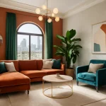
Nostalgic Palette
Terra cotta, a subtle sage green, an antique white and a dark pastel blue are all playing different characters in this color palette, each having a deep meaning. All these shades make for a nostalgic, vintage and a warmth that can transcend time.
Innocence
The dreamy shades in this color palette offers an emotion of innocence, a sense of tranquility in a city like Dubai where everything is always so fast, always on-the-go. This color palette is made up on pink, green and a subdued peach and it somehow slows time down. It offers you some time to relax, to take a breath before taking off for your next project again. This color palette isn’t just elegant, but it also provides you the comfort to feel innocent again. This mesh of classy yet subdued colors offer your interiors a sense of peace, making it a sanctuary for you in the truest sense of the word.
In the end…
As commercial interior design Dubai, we hope we’ve spoilt you with an extensive list of choices for your home in Dubai. Make sure you pick the color palette which speaks to you the most, which resonates with you the most.


